Multi-level and touch friendly dropdown menu
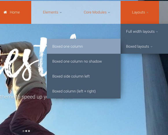
The theme comes with a three-level dropdown menu that you can customise to your needs. It is part of a translucent header-bar that hides on scroll. You can change this behaviour and disable the hiding effect. You can also change the header-bar to static instead of overlay (see example).
Dropdown menus are problematic on touch screens because usually the submenus open on hover. Freestyle takes care of the problem for you so your visitors will be able to navigate the dropdown menu without any problems.
Built-in mobile menu
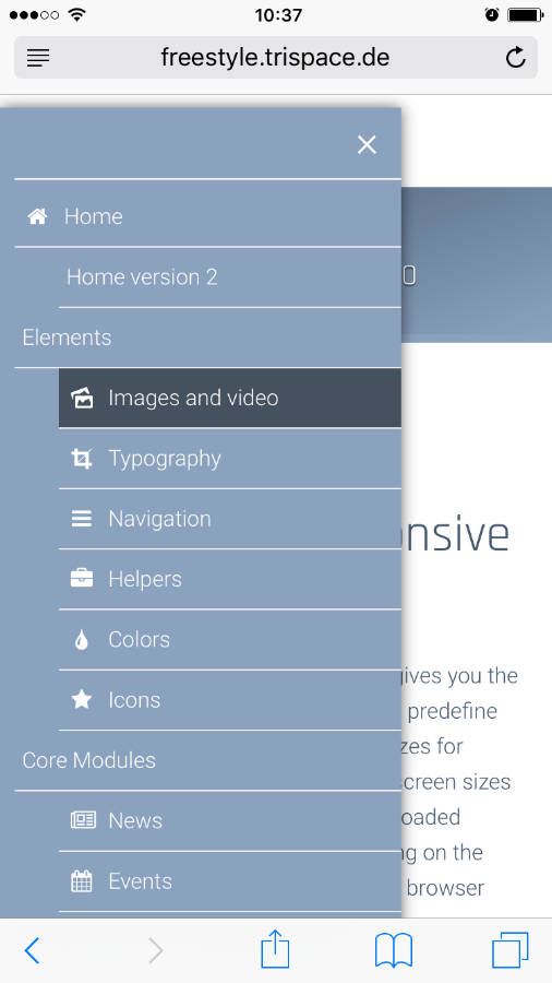
For small screens the main navigation is disabled and replaced with a CSS-only mobile menu that you can further customise. Try resizing your screen to less than 768px to see the effect.
While the menus that come with the theme are a convenient place to start your work, you are not required to stick with them. They are in no way baked into the theme, so you are free to exchange them for whatever you prefer!